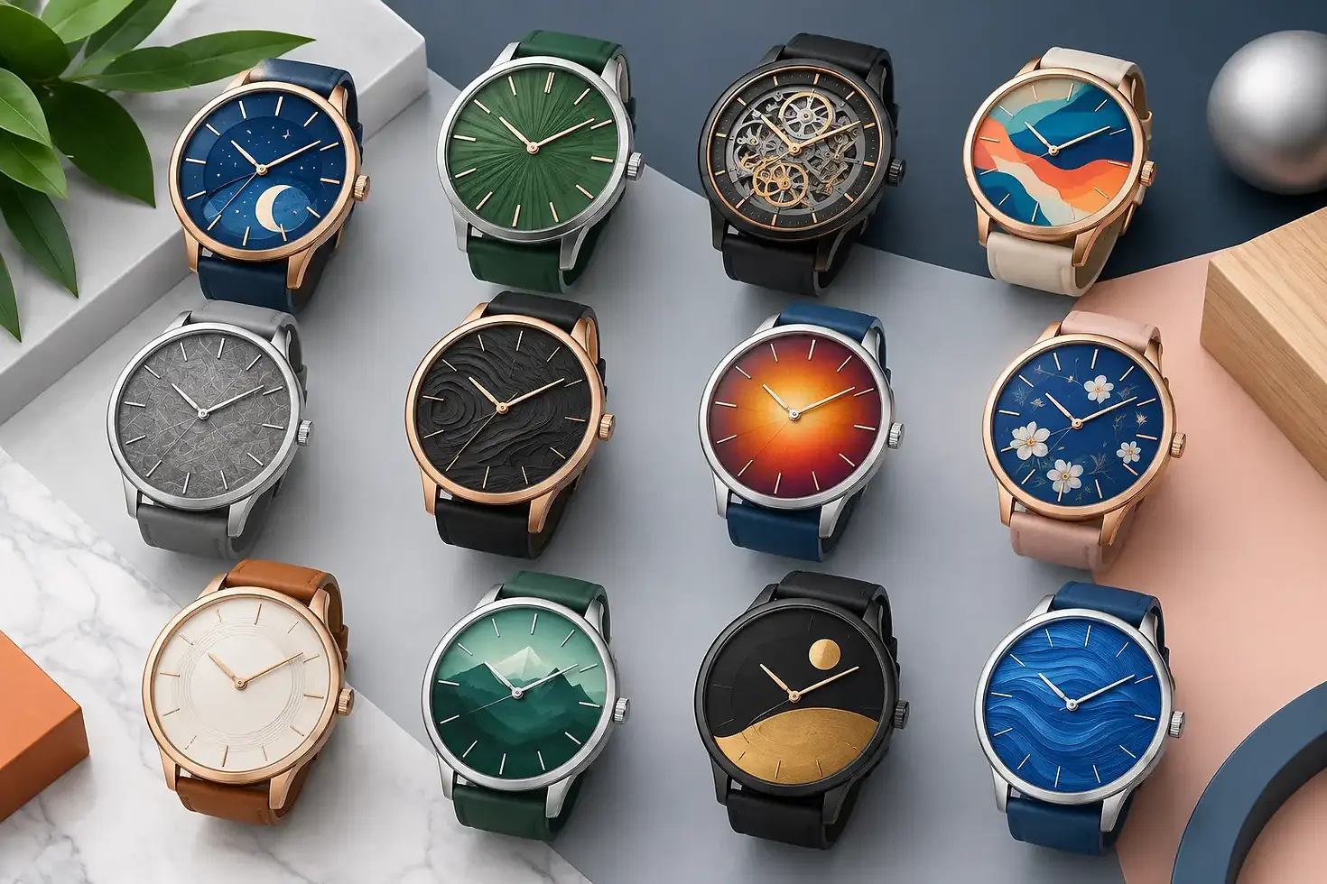
12 Best Custom Dial Design Ideas for Watch Brands
A watch dial does more than display time. It carries the visual identity of the brand, sets the product’s perceived value, and often determines whether a buyer notices the watch in a crowded retail display. The best custom dial design ideas balance a distinctive appearance with clear time reading, realistic production methods, and a price point that supports the collection.
For private-label and OEM watch projects, a strong dial concept should be evaluated early. Changing a color is usually manageable. Changing applied indexes, a multi-layer construction, or a movement-specific dial layout after tooling begins can affect cost, lead time, and production planning.
Best Custom Dial Design Ideas for Branded Watches
The right direction depends on the brand position, target retail price, case size, movement, and sales channel. A fashion watch sold as a seasonal accessory may benefit from bold color and graphic branding. A heritage-inspired collection may require restrained printing, precise indexes, and traditional finishing. These 12 approaches give brand owners practical starting points for a custom watch dial.
1. Sunray dials for refined everyday collections
A sunray dial uses fine radial brushing that reflects light outward from the center. It adds depth without making the design difficult to read, which makes it a reliable choice for dress watches, business styles, and premium fashion collections.
Blue, green, silver, champagne, and black are proven options. The finish is most effective when paired with clean markers and controlled printing. Too many subdials, oversized logos, or competing textures can hide the sunray effect rather than support it.
2. Matte dials for a modern, technical look
Matte finishes absorb light and reduce glare. They work particularly well for field watches, minimalist watches, sport collections, and utility-inspired designs. Black, charcoal, olive, sand, and navy matte dials can communicate a focused, durable product position.
A matte dial also gives applied metal indexes more contrast. However, the surface can reveal dust, scratches, and inconsistent coating more easily during production. Quality control of the paint finish should be part of sample approval.
3. Applied indexes to increase perceived value
Applied hour markers create physical dimension because each index is individually attached to the dial. Polished, brushed, faceted, or luminous applied indexes can immediately make a watch feel more substantial than a flat printed design.
This option suits brands building a mid-range or premium presentation. It does add assembly work and cost, and it requires careful alignment. For smaller case sizes, slim indexes usually deliver a cleaner result than large markers that crowd the minute track.
4. Layered construction for depth and separation
A two-layer or multi-layer dial separates visual elements through different levels. For example, a recessed center can sit below an outer chapter ring, or a raised logo plate can be combined with a textured base dial.
Layered dials are useful when a brand wants visual detail without relying on excessive printing. They require more planning than a standard flat dial. Hand clearance, date-window placement, and total dial thickness must all be checked against the selected movement and case design.
5. Textured surfaces with a clear purpose
Texture can make a familiar watch design feel proprietary. Popular directions include horizontal brushing, vertical brushing, linen patterns, hammered surfaces, grain finishes, carbon-style patterns, and fine geometric embossing.
The key is restraint. A texture should support the watch category and remain visible under normal lighting. Fine textures can disappear beneath dark coatings or glossy lacquer, while deep patterns may compete with logos and numerals. Request physical samples instead of approving texture from a digital rendering alone.
6. Full numerals for heritage or fashion identity
Arabic or Roman numerals can establish a strong personality quickly. Full Arabic numerals are practical for pilot, field, youth, and casual designs. Roman numerals often suit traditional dress watches and jewelry-oriented collections.
Numeral choice affects more than style. It changes the amount of open space on the dial and may require a smaller logo or simplified minute track. Custom typography should be tested carefully, especially at smaller dial diameters where thin strokes may not reproduce cleanly.
7. California layouts for distinctive vintage character
A California dial combines Roman numerals on the upper half with Arabic numerals on the lower half. The format is immediately recognizable to watch enthusiasts and gives a collection a vintage, tool-watch character.
This approach is best for brands with a clear point of view. It is not as universal as simple batons or numerals, so it may narrow the audience. When executed well, however, it provides stronger differentiation than a standard generic dial layout.
8. Minimalist logo placement for premium clarity
A large logo does not automatically create a stronger brand presence. On many successful watch dials, a concise wordmark at 12 o’clock and limited supporting text at 6 o’clock provide better visual balance.
Minimal layouts require precision because there are fewer elements to hide flaws. Letter spacing, print sharpness, logo position, and alignment with the dial center all become highly visible. This is a good option when the brand identity is already established and the goal is a clean, confident product.
9. Contrasting chapter rings for sport and chronograph styles
A chapter ring creates a distinct outer zone for minute markings, tachymeter scales, or color contrast. It is especially effective on dive-inspired watches, chronographs, racing styles, and sport collections where information hierarchy matters.
The contrast should improve reading, not become decoration without function. A white minute scale on a dark dial, for example, can support fast time reading. If the ring is too wide, it can make the center of the dial appear undersized.
10. Luminous details for practical night visibility
Luminous hands and indexes add functional value to sport, field, dive, and outdoor-oriented watches. They can also create a strong visual feature in low-light product photography.
Not every dial needs extensive lume. A dress watch may look more appropriate with small luminous dots or no lume at all. For watches that claim night readability, define the luminous areas clearly during development and evaluate brightness, consistency, and application quality on production samples.
11. Color blocking for seasonal collections
Color blocking uses deliberate contrast between the dial base, indexes, hands, chapter ring, or subdials. It can give a private-label collection a recognizable signature while allowing the same case and movement platform to serve multiple colorways.
This is commercially useful for brands testing a new market. A conservative black or silver dial can sit alongside bolder green, burgundy, orange, or ice-blue versions. The trade-off is inventory complexity. Limit early color options to designs supported by a realistic buying forecast.
12. Custom date windows and special indicators
A date window can be integrated quietly at 3 o’clock, placed at 6 o’clock for symmetry, or framed with a contrasting border. Some brands use color-matched date discs to reduce visual interruption, while others use a high-contrast date display for function-first designs.
Small details matter here. The window must align correctly with the movement date disc, and the chosen font should remain legible through the aperture. If the project includes day, 24-hour, moonphase, or chronograph indicators, the dial layout must follow the exact movement specification from the start.
Design for Production, Not Only for Renderings
The most attractive dial rendering can still become a weak product if its construction is not controlled. Before approving a design, confirm the dial diameter, feet position, movement compatibility, hand stack clearance, index attachment method, print colors, and finish specification. These details protect both product quality and production efficiency.
It is also wise to define a hierarchy before development begins. Decide what the customer should see first: the brand name, the time, the texture, or a functional complication. A dial that tries to make every detail dominant usually looks less premium than one with a clear focal point.
For OEM and ODM projects, sample review is where design intent becomes measurable. Examine dial samples under daylight, direct indoor lighting, and low light if lume is included. Check index alignment, print edges, logo position, color consistency, dust control, and the relationship between the dial, hands, and crystal. Honour Time Corporation Ltd. approaches these decisions as manufacturing requirements, not only styling preferences.
A well-designed dial gives a collection its own identity before the customer reads the brand name. Start with a concept that fits the market, then refine it through real samples until every detail supports the watch you intend to deliver.


Comments